NOTE
My first version of this post had an irrelevant and (it turns out!) wrong explanation of a protocol calamity perpetrated by the British Embassy in Warsaw during The Queen’s State Visit. That passage now removed!
+ + + UPDATE + + +
More gory details are emerging. Never underestimate the Human Factor. And our old friends lack of concentration – and stupidity.
* * * * *
It’s harder to imagine a higher profile bungle than the Oscars Best Picture Award debacle that happened a few hours ago.
The winner was announced as La La Land and they were busy accepting their award on the stage itself when they were told that Moonlight had won. So much #fakenews these days. It’s hard to keep up.
Watch what happened:
The point in organising anything is that it is all about the Big Picture: tone, comfort, mood, message (explicit and implicit) and so on. But that Big Picture is made up of countless microscopic details, all of which need checking and rechecking. One footling gaffe somewhere unexpected can have Chaos Theory-like ripple effects that wreck everything else.
So what EXACTLY went wrong at the Oscars last night?
This seems like a reasonable account:
How is it possible that the La La Land producers not only made the triumphant walk to the stage, but Platt finished his round of thankyous, and Horowitz began speaking, before the mistake was addressed. Sources said that one of those accountants apparently told a stage manager, who handed the correct slip to Horowitz.
Why was it incumbent on this producer, who just had his dreams dashed on a global stage, to announce the real winner? Where were the producers at this point? And why didn’t Beatty bring things to a screeching halt and insist that Kimmel or one of the show’s producers take a look at what clearly was a bogus winner card? There is clearly blame to go around, but the scrutiny will be placed on PricewaterhouseCoopers, the accounting firm that tallies the votes and keeps them secret until they can be revealed at the Dolby Theatre.
… there is strict protocol designed to prevent gaffes. Only two partners in the firm, Martha Ruiz and Brian Cullinan, know the winners beforehand. Each carries a briefcase with a duplicate set of the 24 winners, and they stand on either side of the stage to be able to hand winning slips to presenters, depending on which side of the stage they approach from. Best Actress winner Emma Stone said tonight that she still has her winning slip, and Beatty and Kimmel said the Best Picture winner was read from a duplicate of her prize. So the Academy and the accounting firm will have to answer how a system designed to be foolproof could have led to the worst possible screw-up…
One clue lies in the fact that there are two sets of envelopes, each with a full set of winners. Once there are two sets of over 20 envelopes in play, the chances of confusion in the heat of the moment grow exponentially.
These chances were increased again by the seemingly irrelevant detail of how the envelopes and cards were printed.
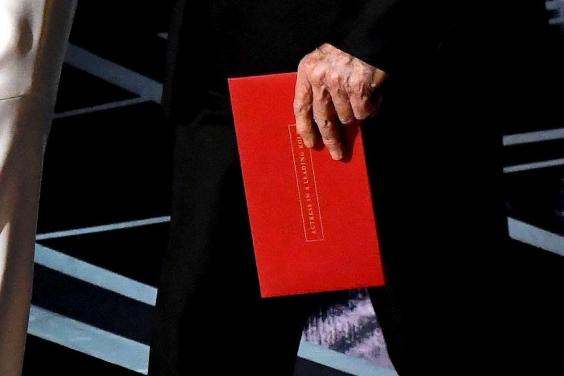
Here’s the envelope that Warren Beatty and Faye Dunaway used in making their doomed announcement of La La Land:
The envelope says Actress in a Leading Role (ie it’s the Best Actress award). But look at it closely. The font and colours are designed to make it look nice and elegant and discreet for the audience in the hall and on TV – NOT to help the person on the stage amidst all the lights and excitement spot at a glance if anything is wrong.
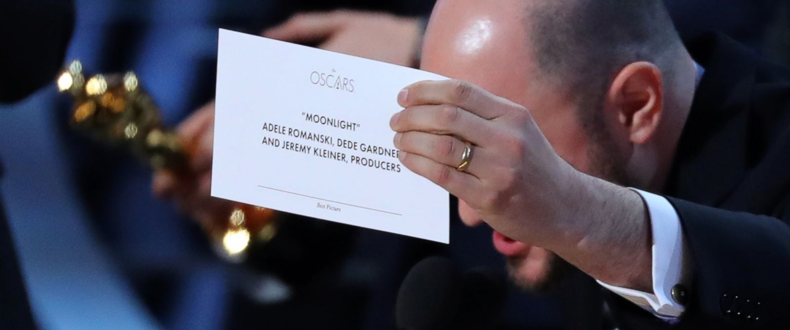
The card inside is even more badly designed:
This is the card for the winner Moonlight. But look at the ridiculous teensy almost invisible Best Picture font at the bottom of the card, and indeed the poor layout of the card as a whole. The biggest, most prominent and utterly useless information on the card is the logo of The Oscars. By this point people probably know where they are and what’s happening.
Hence a hapless stressed person making the announcements can be forgiven for not spotting immediately that the category of the card was not the category of the announcement.
The card should have been laid out roughly thusly, so that the presenter can see at a glance what is going on, with the most important information linking the names/movie to the category given the maximum emphasis:
BEST PICTURE
Moonlight
Names of producers
The Oscars
Big bold fonts that dominate the card and leave virtually no room for error.
Details. Details. Details.
Never assume.
Pick the tool for the job.
Here the job is not for the card to look nice on Google images or to the audience or on a computer screen. The job is to help the announcer on the stage announce the right winner.
Simple. Yet these incredibly highly paid professional people from PricewaterhouseCoopers and the Oscars side together messed it up. Tsk.
Watch this video on the fontish/typographic aspects of this nonsense. It complements the above analysis nicely:


Actually it's, 'Pick the RIGHT tool for the job.' of as Ricky Roma said; 'You never open your mouth until you know what the shot is.'
Good as always. As an amusing aside, I do remember being invited to a reception at the Residence while you were ambassador in Warsaw and, clearly, a mistake had been made since you said: "What are you doing here?" My reply of: "I don't know – you invited me" passed muster and you allowed me to stay and had a very enjoyable evening affecting some knowledge of defence matters.