Peruse the Internet for advice on how to create a good PowerPoint presentation and you find different Rules.
One famous Rule is the 10/20/30 rule promulgated by venture capitalist Guy Kawasaki:
It’s quite simple: a PowerPoint presentation should have ten slides, last no more than twenty minutes, and contain no font smaller than thirty points.
While I’m in the venture capital business, this rule is applicable for any presentation to reach agreement: for example, raising capital, making a sale, forming a partnership, etc.
Any presentation!
What bad dull advice.
It involves the audience looking glassily at each slide with its teensy fonts for two minutes or so.
Sick of that rule already?
Try the Rule of Sevens:
Use no more than 7 words per line and no more than 7 lines per visual
If you need more words, make sub-points below the main point
Only present one main point with a maximum of six sub-points on a slide
Use your slides to emphasize a point, keep yourself on track, and illustrate a point with a graphic or photo
Keep your font size 24 or bigger.
Hmm. 7 lines per slide? That’s already too many. And 24 font? Are you serious?
OK! What about the 6 6 6 Rule?
A good way to keep yourself in line is by remembering the 666 rule. Presentation University recommends slides shave (sic!) no more than six words per bullet, six bullets per image and six word slides in a row
As we all know, 666 is the Number of the Antichrist. So better avoid that one.
So then, it’s the 2/4/8 Rule?
Zzzzzzzz
#Sighs
Here’s the Crawford Rule.
Don’t have rules!
These so-called rules are boring. Constricting. They ‘frame’ the issue in the wrong way.
Instead think about how to make your presentation BIG.
If the presentation looks BIG, the speaker is far more likely to come across as BIG, the issues will sound BIG and the audience will feel that they are part of something BIG.
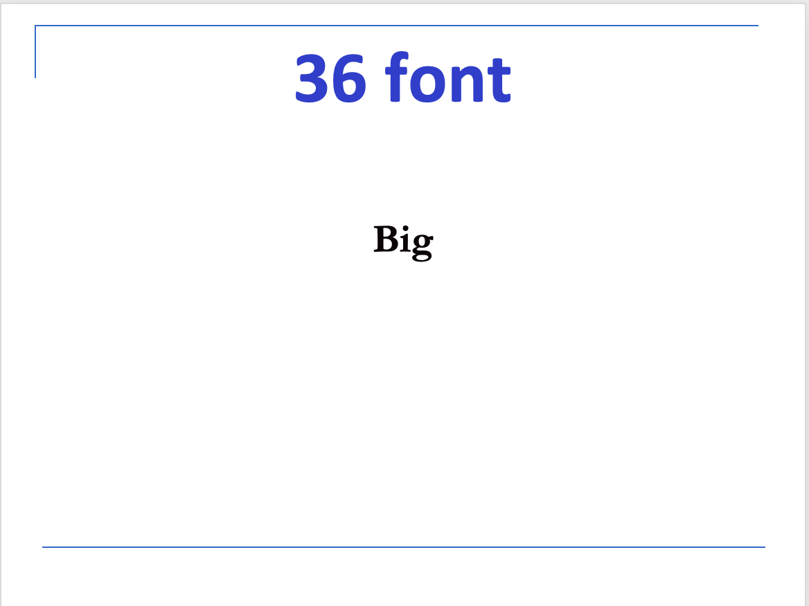
Take font-size. Here in black is 36 font – the blue font is 66.
Look how puny that 36 is, even though it’s bigger than what some of these Rules suggest.
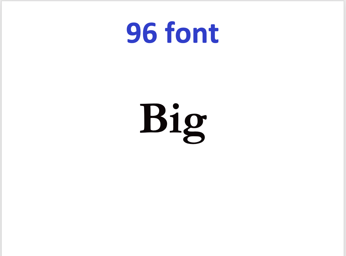
How’s about 96 font? Better…
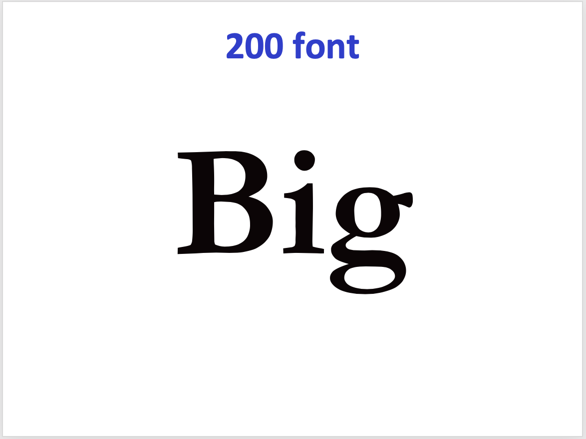
Let’s move it up to 200 font. Ah, now you’re talking. That slide has some ooomph.
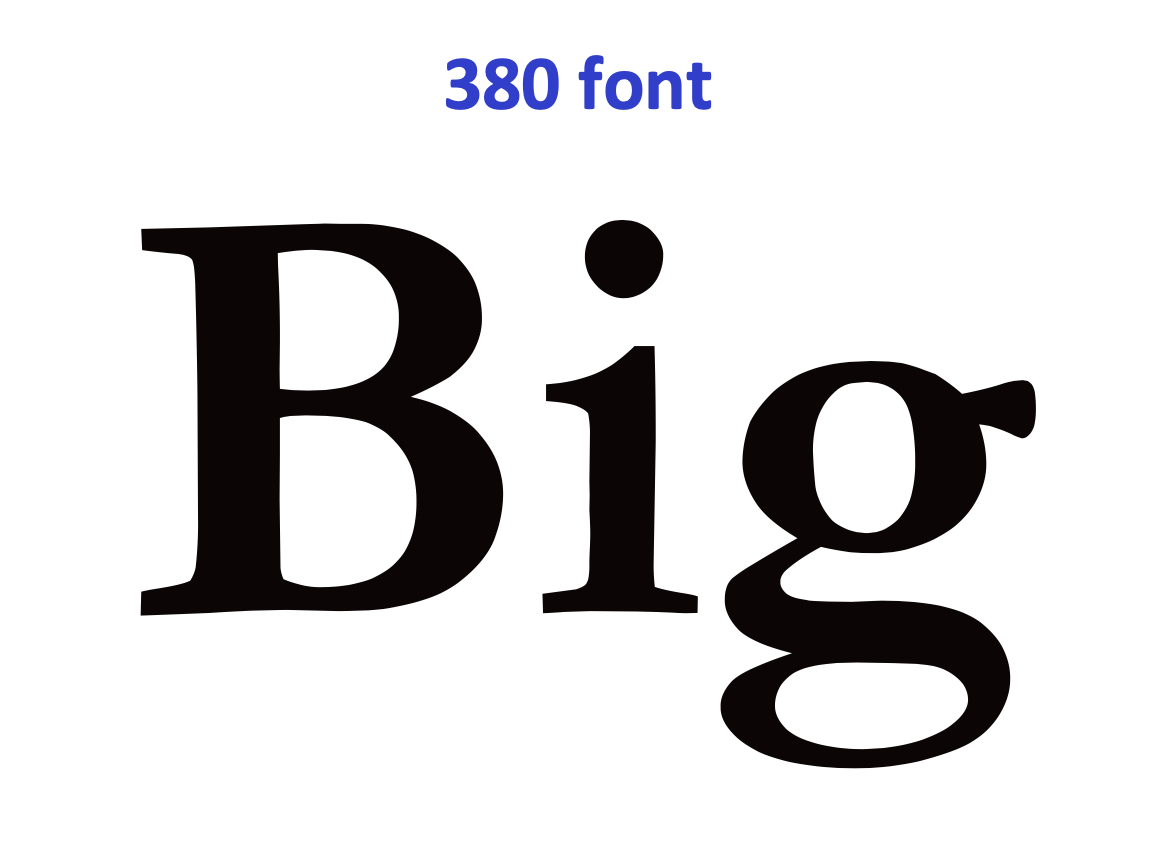
How’s about 380 font?
Good. Now this looks and feels BIG! The speaker gets confidence from this.
But … can we do even better?
Yes we can! A magnificent 700 font.
Probably the largest font on a PowerPoint slide OF ALL TIME.
Now, THIS is BIG!
That slide completely dominates the room. The speaker is in control. Plus everyone is having a good time.
Likewise with images. Don’t use an image like a bad postage-stamp:
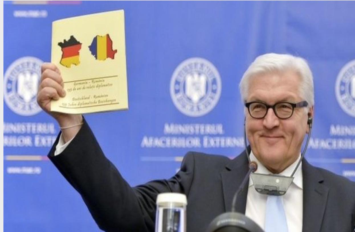
Fill the slide. Forget words. Let the image speak for itself. As it does here:
“But wait!” they wail. “We can’t avoid using our organisation’s PowerPoint template!”
To which one replies: “Tosh!”
Within these dreary templates there are all sorts of options for fonts and sizes. Use them.
Plus there’s a design aesthetic in play here. Your presentation is your chance to sparkle. Not to be like everyone else. The slides need to reflect and enhance your energy and command.
And, in the end, to whom do you owe your loyalty?
To the long-lost hapless PowerPoint template design guy who knew nothing about presenting?
Or to the audience sitting in front of you on the day, waiting to see if they listen to you or play CandyCrush?





Excellent piece
The biggest offenders are academics and "marketing executives"
Best rgds
You have yet to experience UN system PowerPoints…
Agree with all of this. Never use words when images are available!